
Icebreaker Checkout / UX
The initial effort was an extensive redesign of the page – from overhauling the layout to refining the micro-interactions, no stone went unturned. But it didn’t stop there. After a successful launch of a revamped checkout experience, we went on to build and integrate several more sexy checkout features from the ground up.
my role: design lead / research and testing lead
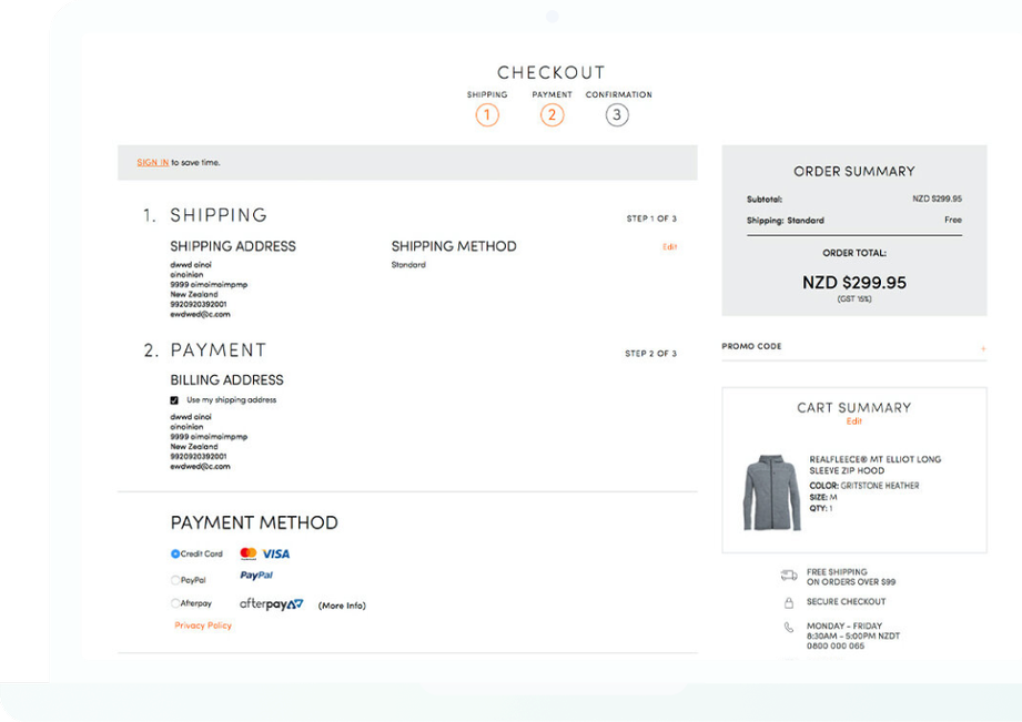
The Problem
When initially looking at the checkout page in its original form, aside from the messy splattering of content on the page, the fields themselves didn't have clear focus/error states and it wasn't always apparent what content was there just to be informative, and what required input and interaction. The design also didn't consider the mobile experience much at all. Trouble. It had lots of room for improvement, to say the least.
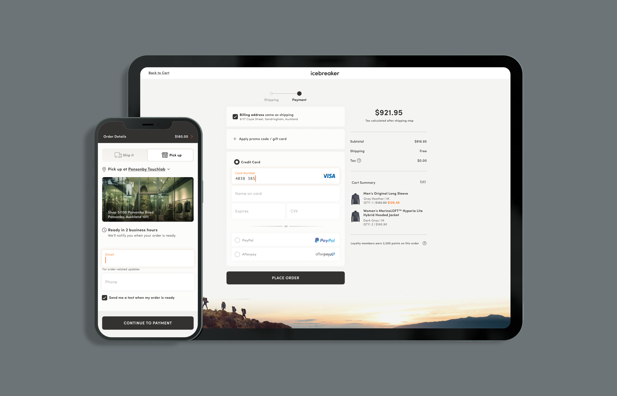
Shipping page revamp.
By transforming the UI into a refined, simple and elegant design and infusing extra clarity where needed, the experience became much smoother, clearer and more pleasant. Reduced friction, woot!
There were several small details that were implemented as a direct result of our customers’ feedback. A favorite of mine was adding “Get it in X days” to each shipping method. It seemed so obvious once we realized we needed it, but it made a big impact on the customer experience.
The updated payment page.
62% conversion rate increase.
That’s right. After the hefty revamp, the checkout pages saw a 62% increase in conversion rates on mobile. Overall increase across all devices was a nice 18%.
A step further.
Launching the new iteration of the checkout page wasn’t the end. Far from it. Further integrations followed. Here’s a couple of my favorites…
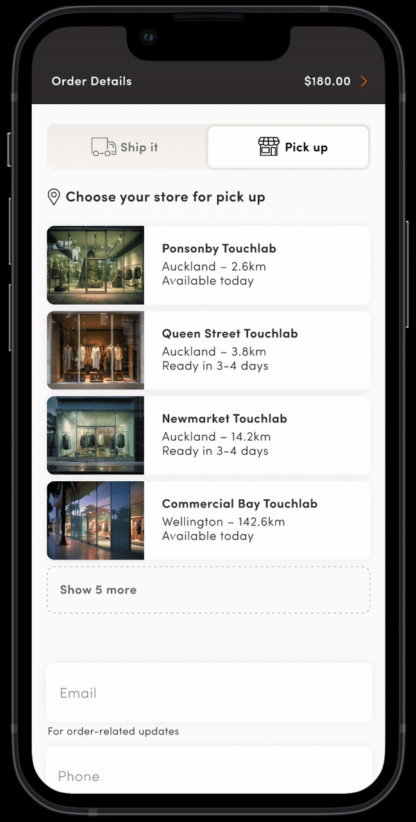
Click & Collect.
Adding the ability for a customer to pick up from a store was a key priority of the business at the time and was surprisingly complex to implement – but we got it done! In the final design seen here, after the user selects the “pick up” toggle, they are presented with a list of stores near their location, with each store showing how quickly the order could be ready for collection. Once a store selection is made, the menu collapses to display the store address and additional pick-up information.

And… Gift with Purchase.
This feature enabled customers to select a free gift if their purchase met the promotion requirements. In this case, the platform already had the ability to handle this, but the out-of-the-box integration often left customers absolutely livid anytime we ran the promotion. We’d get nearly 20% of customers contacting customer service claiming we made false promises by not allowing them to choose their free gift. A huge issue. The truth was, the UX was so poor, they just weren’t able to figure it out.
I ended up analyzing several dozen customer comments and watching shoppers attempt the old gift selector before designing a completely new experience – which I extensively user tested. Once implemented, the next time the promotion was ran, the total amount of customers contacting customer service complaining they couldn’t select the free product we’d promised them was exactly ZERO!