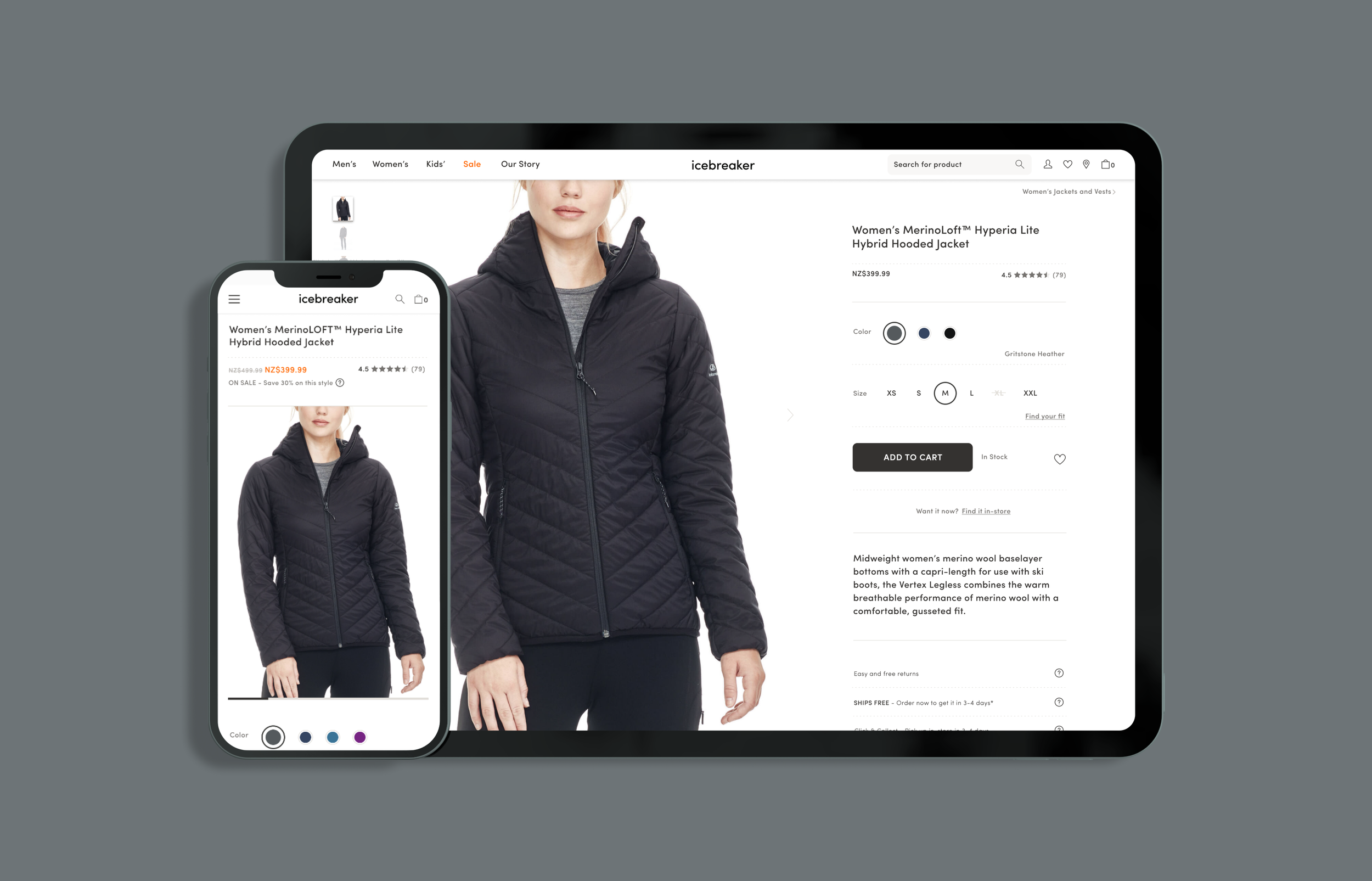
Icebreaker Product Page / UX
Not only did this multi-faceted project involve creating a new, cleaner look with improved UX – but several new features were built from the ground up, and involved critical and often very complex collaboration across teams.
my role: design lead / research and testing lead / product owner

The Problem
The clothing was premium (and expensive!), but the experience wasn’t. Everything from the imagery to the info was uninspiring, overwhelming, and a cumbersome to navigate and absorb. There were problems a’plenty, and the metrics of the page and general user experience suffered.
User Need
I need to clearly see and understand every detail of your clothing so I can be confident if I buy it, it’ll be exactly what I expected.
Discovery during the concept phase.
Early concepts were used to guide conversations and uncover risks and challenges. One big one, for example, was the variability of product information – e.g. an item could have one or many images, color options, and varying depths of text-based detail. Some earlier proposed designs were much more ambitious but only worked for a very specific type of product. Furthermore, a design like the concept shown here would have met our goal of making it feel premium, but the business admin of launching every new season would have taken a huge hit. The final design had to feel premium and be flexible enough for varying product content and be easy to set up in bulk.
Cross-team collaboration.
A large part of this project was undertaken by a special and independent cross-functional agile squad. The unique skillsets of people from the platform team, product team, and marketing team was integral to the success of this project. I had the honor (and challenge) of wearing two hats: UX Designer and Product Owner.
A highly complex and multi-faceted project made of several initiatives.
This project was a very large epic with dozens of stories that spanned a long period of time. Some of the initiatives are highlighted here, but others include implementing a store inventory feature (seen to the right), the display of multiple products within a set, enhanced size information metadata, revamped customer reviews and more.
User feedback and testing.
One of many things we learned as we experimented, was that our shoppers really preferred seeing products on a model and practically drooled when there was a video available. This insight allowed us to convince the business to put more resources into product imagery. Conversion rates on the products with upgraded imagery increased as a result. Nice.


